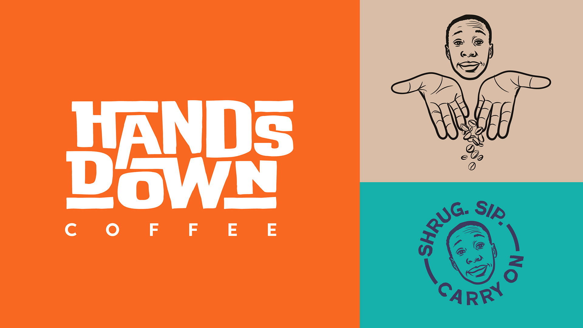
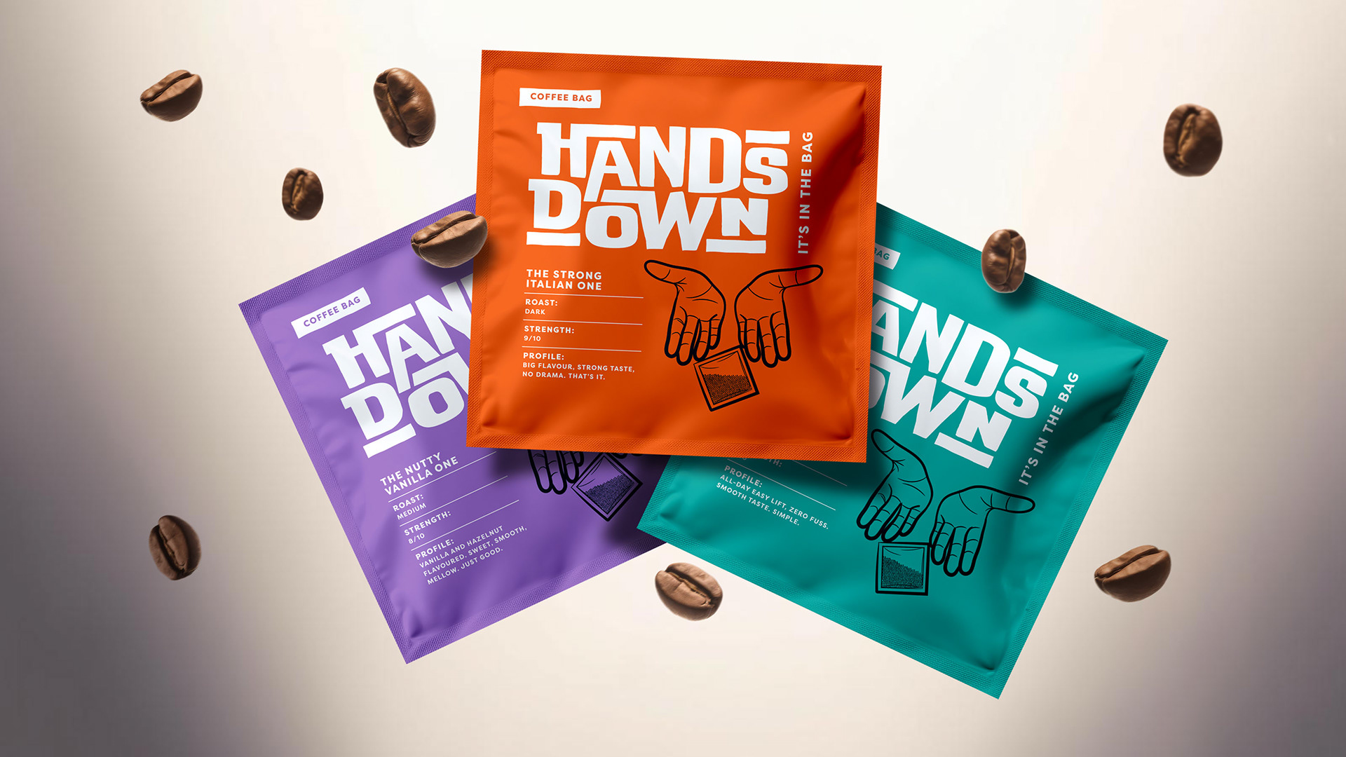
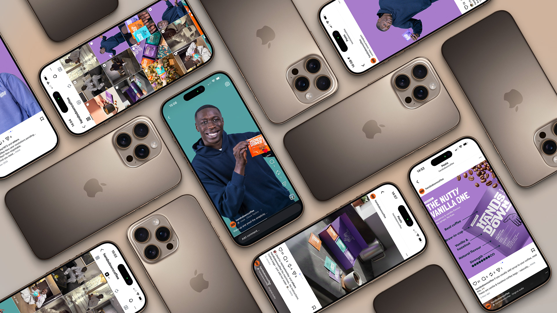
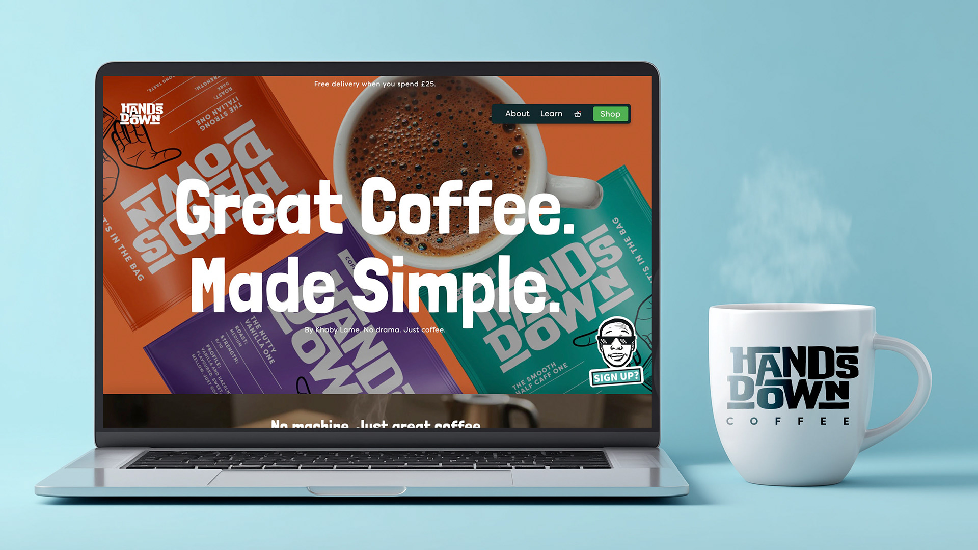
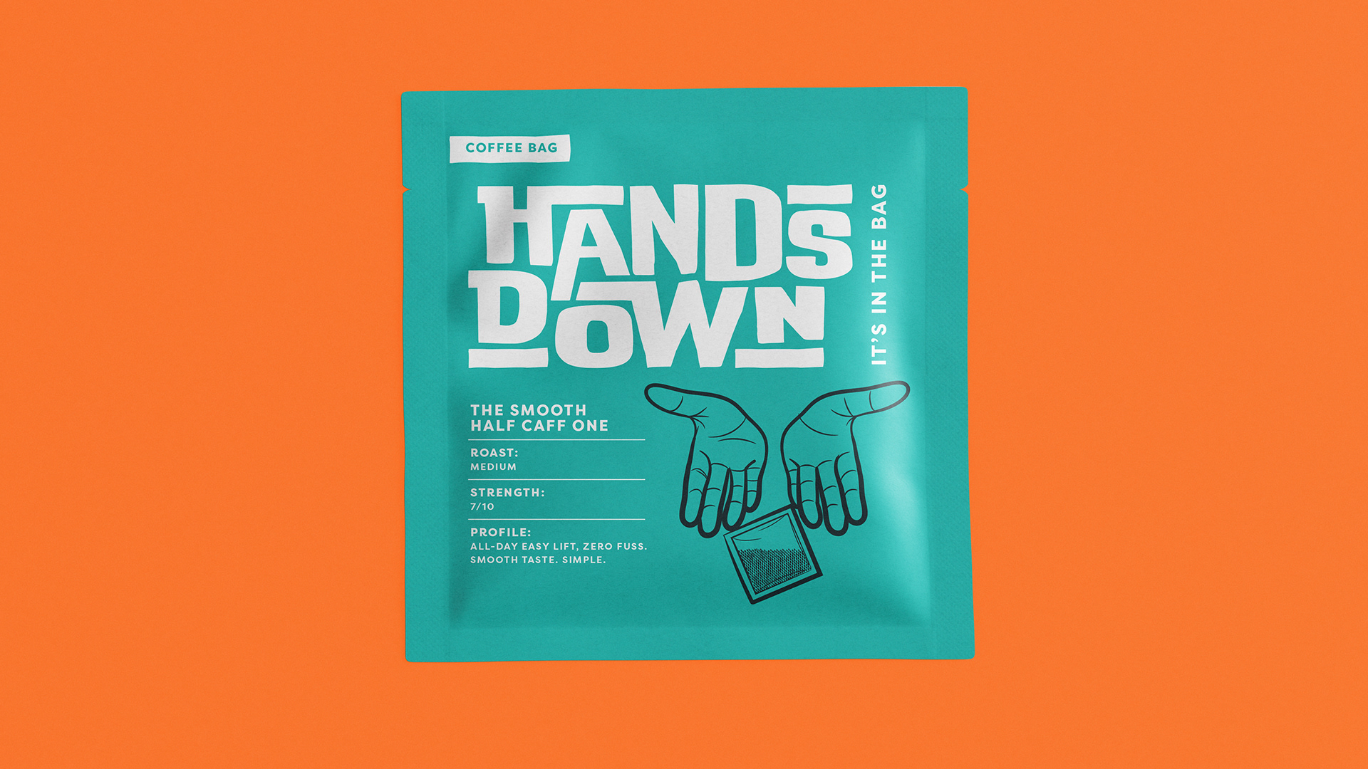
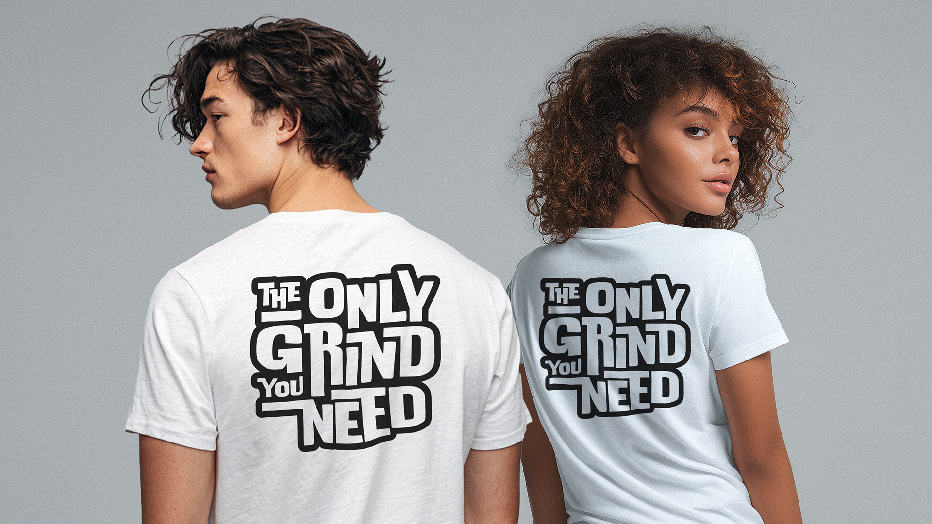
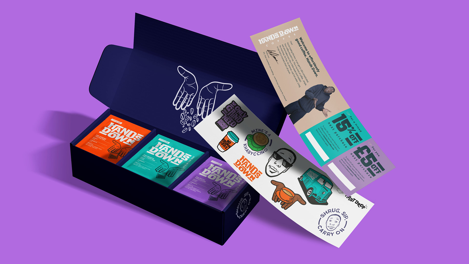


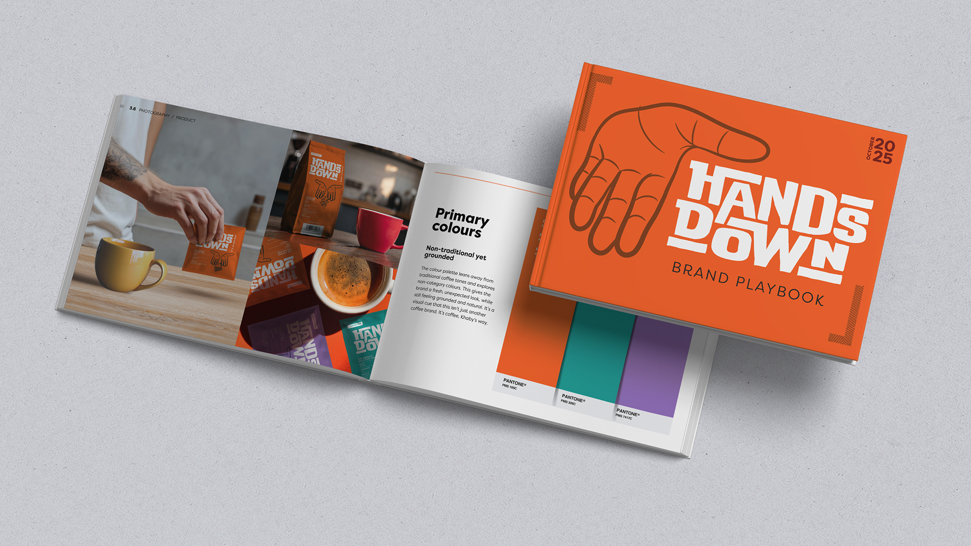
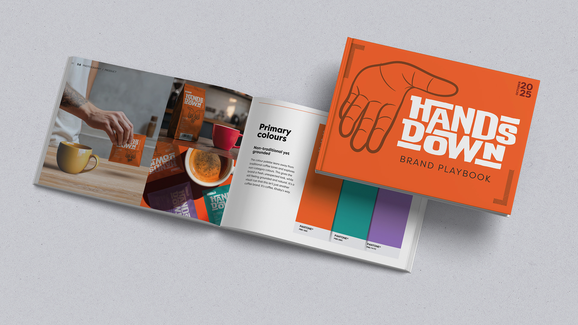

Hands Down came to me with the name already in place and Khaby Lame at the heart of the brand. My starting point was Coffee Made Simple. A positioning that felt completely natural for Khaby and his way of cutting through unnecessary complication. Visually, I picked up on something else unmistakably Khaby. His hands. They became the basis of an identity that could work across packaging, cans and social without relying on his face all the time. The result is bold, graphic and playful, with Khaby’s personality running through it without turning the brand into merchandise.